My photo
Every man is said to have his peculiar ambition. After having explored different fields of their kind Jyoti Jhunjhunwala finally found her heart in art itself. Whether it be wild or not she has much more than choosing a color palette or finding the perfect art piece. Earlier INIFD and then Raffles Design International provided her the platform to identify and showcase her true potential by giving her challenging projects in different fields of designing like offices, retail store, kindergarten, furniture, and residence. This enabled her in being a firm believer of designing things differently by striking a correct balance between aesthetics and functionality.

Wednesday, 23 March 2011

KINDERGARTEN DESIGN

WORKING FIELD : INSTITUTIONAL DESIGN
INSPIRATION : ANIMAL FOOTPRINTS
LOCATION : JNS PLAYGROUND, MUMBAI
AREA : 36,000 SQ.FT.


      The idea was to create a mini city and use train for circulation running on an ellipticalpath. Each room stands separately with a timber ceiling and columns supporting it.  All rooms are connected by outdoor play area with grass throughout and swings placed having a fun filled environment. The use of glass for the structure helps the surrounding interact with indoor spaces thus making the environment open and lively. The area surrounding the elliptical path is used for recreational activities and dining to give the feel of travelling by train and going to a new place.


SKETCHES

CHARCOAL SKETCHES

PENCIL SHADED SKETCHES

PASTEL COLOR SKETCHES 


Tuesday, 22 March 2011

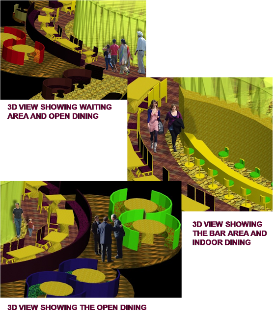
MAGNIFIQUE FLEUR- RESTAURANT

THE INDIAN CUISINE RESTAURANT ON A WATER BODY

WORKING FIELD : RESTAURANT DESIGN
INSPIRATION: LOTUS, NATIONAL FLOWER OF INDIA
LOCATION : BANDRA TALAO
AREA : 5127SQ.FT.


The overall idea is to give the feel of a magnificent flower floating on water. The idea of how each petal connects to the center of the flower is used and are functionally distributed to form the following areas- open dining, private dining, waiting area and toilets. The structure is made up of metal pipes with light and A/C services running through it covered with glass making one feel close to nature. Keeping in mind the importance of colors in interiors the two royal colors- purple and golden are used which gives a rich feel and slight touch of red and green adds to the indian feel of the restaurant.


Monday, 21 March 2011

OFFICE DESIGN

MEDIA HOUSE


WORKING FIELD : OFFICE DESIGN
INSPIRATION : CIRCULAR ORGANIC SHAPES
LOCATION : HI LIFE MALL, MUMBAI
AREA : 2262 SQ.FT.

When it comes to an office design one always thinks of something linear and so the idea was to do something different and design something which is circular or organic.Radial arrangement is used with workstations placed in the center to highlight the area which is  6” below the floor level. The colors used in the office are bright and lively considering it is an office for the media house. 


Sunday, 20 March 2011

PORTABLE WORKSTATION DESIGN


It was inspired by the foldable system and for the fact that sitting on a bike and working on it is a total different and a fun experience ! So the workstation gives the experience of getting on to a bike and working. The use of metal gives it a complete machine look giving an overall different experience of working on it. For the folding mechanism of the two arcs hinges are used.


RETAIL DESIGN

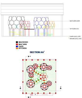
APPLE STORE DESIGN

WORKING FIELD : RETAIL DESIGN
INSPIRATION : MOLECULAR STRUCTURE
LOCATION : HARDROCK CAFE, MUMBAI
AREA : 5962 SQ.FT.


Individual pods were designed using interlocking circles forming molecular structures each having a digital screen on it thus creating individual interactive cells for understanding and use of products


The advantage of good height of the space was used and two levels were created.  
Level 0 is the area with basic functions like billing and product buying when one is decided of what he wants. The idea of having a wall free store to double the visual space isincorporated. The elevators and pods are placed in such a way to customize the search and make product buying a fun experience for customers.
Level 1 is the personalized area where individual pods are created for each apple product. It is the interactive area of the store where a person can have an experience of interacting with the product with digital display screen on circles, creating the pod, giving a tutorial for use.


Saturday, 19 March 2011

RESIDENTIAL DESIGN

TERRACE APARTMENT

WORKING FIELD : RESIDENTIAL DESIGN
INSPIRATION : ABSTRACT AND FLORAL DESIGN
LOCATION : MEGHNA APARTMENTS, MUMBAI
AREA : 2450 SQ.FT.


The idea was to merge common function areas and private function areas in such a way that it isn't a hindrance to privacy. All the common functions are zoned in the lower area and private functions in the upper area with few common functions connecting them. All rooms stand on stilts maintaining their separate identity but at the same time well connected by  a common functional area. The use of glass makes the atmosphere very calm and warm doubling the visual space and creating a spacious environment.